
Mapping NTIA's Broadband Investments
To illustrate the impact of the $4 billion Recovery Act investment in the Broadband Technology Opportunities Program (BTOP) and State Broadband Initiative (SBI), NTIA has developed a user friendly online tool to visualize the high-speed broadband networks, public computer centers and Internet training programs funded across the country.
 The BTOP map went live in 2012 with data submitted by NTIA’s grantees in their 2011 progress reports. And we recently updated the map using data from last year’s progress reports.
As of the end of 2012, our projects had built or upgraded more than 86,000 miles of high-speed network infrastructure and connected more than 12,000 schools, libraries and other anchor institutions. They had installed more than 41,000 workstations in public computer centers, provided more than 12 million hours of computer and Internet training to more than 4 million people, and recorded more than 521,000 new residential broadband subscriptions.
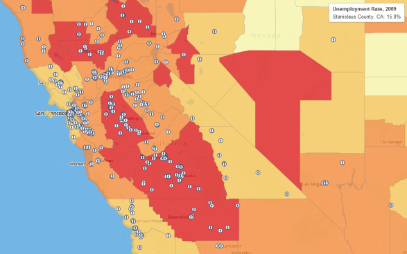
The map – located at http://www2.ntia.doc.gov/BTOPmap/ - lets users drill down beyond these high-level numbers. Select a state or type in a zip code and the map will show the broadband networks that NTIA is funding in that location, as well as the anchor institutions that are being connected by those new networks. The map also displays local computer centers that offer broadband access to the public, and local training programs that are teaching digital literacy skills to those who need help getting online. In addition, the map features “state dashboards,” which provide snapshots of the investments on a state-by-state basis. All of the data sets underlying the map are available through a downloadable Excel file.
 NTIA’s map is a valuable tool to help Americans see the benefits that these broadband investments are bringing to their communities and to find local resources that are available to them, such as public computer centers or digital literacy training opportunities. Equally important, it helps taxpayers track how their tax dollars are being spent and hold the government accountable for those investments.
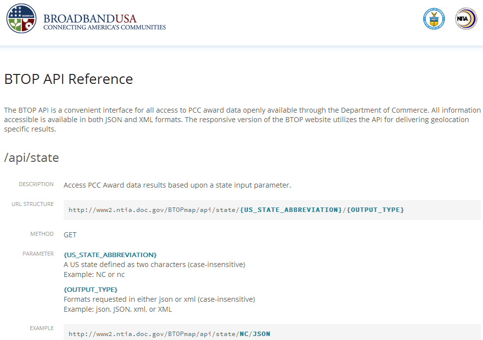
We hope that other government agencies, academic researchers, non-profits, commercial carriers and other stakeholders will come up with innovative applications for the map and the data underlying it. We see particular potential for the map data to be used in “mashups” that would combine it with other types of data – such as local employment figures or regional economic indicators – to create new online tools and resources. We’ve added a number of features and enhancements to the map to make this easy to do. Those include a “map layering” function, which enables users to “overlay” data visualization layers from the map with data layers from other sources, and an Application Programming Interface (API) for our computer center projects, which allows other organizations to use the data in their own maps and applications to help users find local public computer centers.
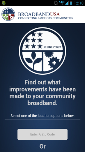 One other exciting new feature is a mobile version of the map. When accessed through a smartphone, the map appears as a simplified, mobile-user-friendly version of the larger site. Users can easily navigate the map and choose filter options with the simple swipe of a finger. Smartphone access allows those who have a cell phone but not a computer to easily find public computer centers and training programs in their local communities.